What Good Looks Like
The bar a Rising Tide template is held to - seven principles, the checks every published set passes, and the sets themselves.
The templates the protocol ships are the level to beat. Every one of them was drawn to the same seven principles and passes the same checks, and both are written down here so the bar is published rather than implied. A template that meets them is one a collector would want to own, frame or screenshot. A template that is only correct has not met them.
Seven principles
- An object, not a background. Draw a thing: a found letter, a printout, a manuscript leaf, a torn notebook page, a sign on a wall. Its silhouette, edges and material say what it is before a word is read. A rectangle with a coloured fill does not.
- Designed for the thumbnail. Most people meet your template at about 200 pixels wide, in a grid. The object, the title and your signature moment have to read at that size, and the words have to be legible at 400. Tiny decorative labels do not survive it, so cut them.
- The composition fills the sheet. Draw a layout for the product it frames. No empty lower third, and no footer pinned to the bottom edge as an afterthought.
- Material, drawn as shapes. Paper fibres, stains, a stepped vellum edge, punched holes, foil, glow - all of it as flat shapes. Never a noise texture: it multiplies the size of the saved image several times over. Blur and glow are fine. Keep smooth gradients to small areas.
- One signature moment. The thing people remember - a painted initial, a brush circle, a lit tube, a wax seal. Put your effort there and keep everything else quiet.
- Palette discipline. Three or four colours, each with a job. Accent colours are never used for body text.
- Type that belongs to the object. A typeface that suits what you drew, from an open licence (OFL or Apache).
The checks
A template is ready when all of these hold. Most of them are checked for you when you submit; the first two are judgement, and they matter most.
- Side by side with the published sets, it does not look older.
- At 200 pixels, the object, the title and the signature moment all read.
- The longest content fits. Render it with the longest title, subtitle, body and names the product accepts - a 50-character display name, a full-length letter. Nothing prints over anything else and nothing is cut off.
- It is readable at its worst. A page's body, at the product's full length, still sets at a size that reads on a phone, in a column of 45 to 75 characters. The studio tells you where you land. Canvas and Readability explains the numbers.
- The saved image keeps its resolution. An owner can save their piece as a PNG, and that image has a size budget. A template that fits it at high resolution with the longest content is one whose owners keep a sharp copy. The volume of text is what costs the most, so a long page is the case to test.
- Contrast holds, for body text especially.
- Every product it offers still renders, including the states a product can be in: a letter with and without a reader's note, a page without a title, a match that was drawn.
How the published sets meet it
Every set below is one object with one signature moment, drawn at every product it offers.
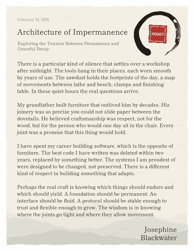
Zen Garden is an ink-wash painting on washi. The signature is one large brush circle; a haiku sits inside it, and the edition number is a red seal.
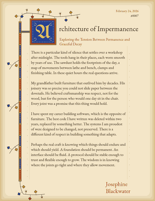
Illuminated is a manuscript leaf. The signature is the painted initial, which takes the first letter of the author's own title or poem at render time.
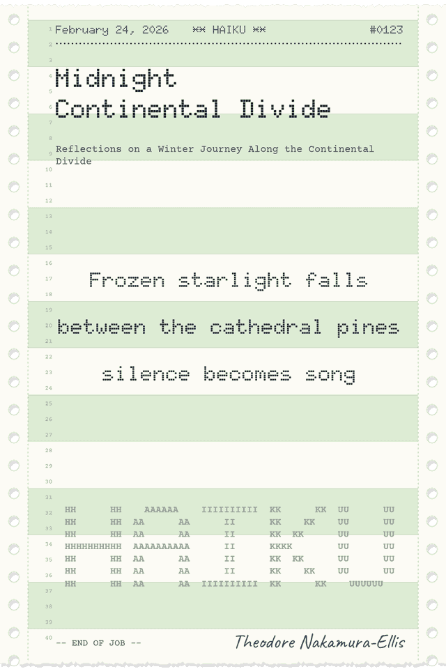
Mainframe is a tractor-feed printout. The sprocket strips and green bars say what it is at any size, and poems sit on the printer's own row grid.
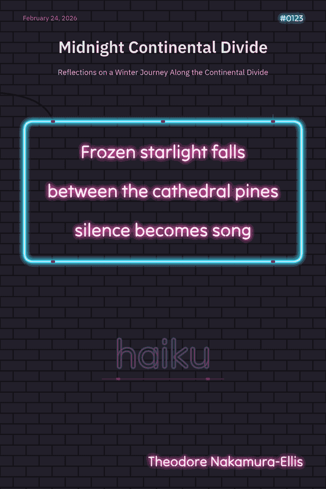
Neon Digital is a sign on a brick wall. The haiku is the sign.
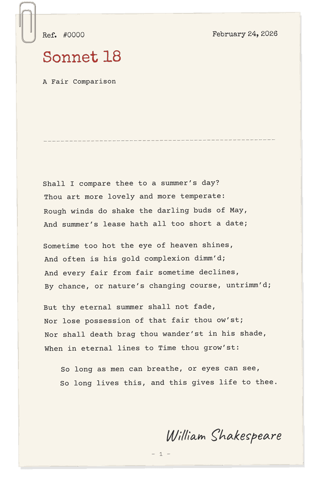
Typewriter is a single typed sheet under a paper clip, the title struck in the red half of the ribbon.
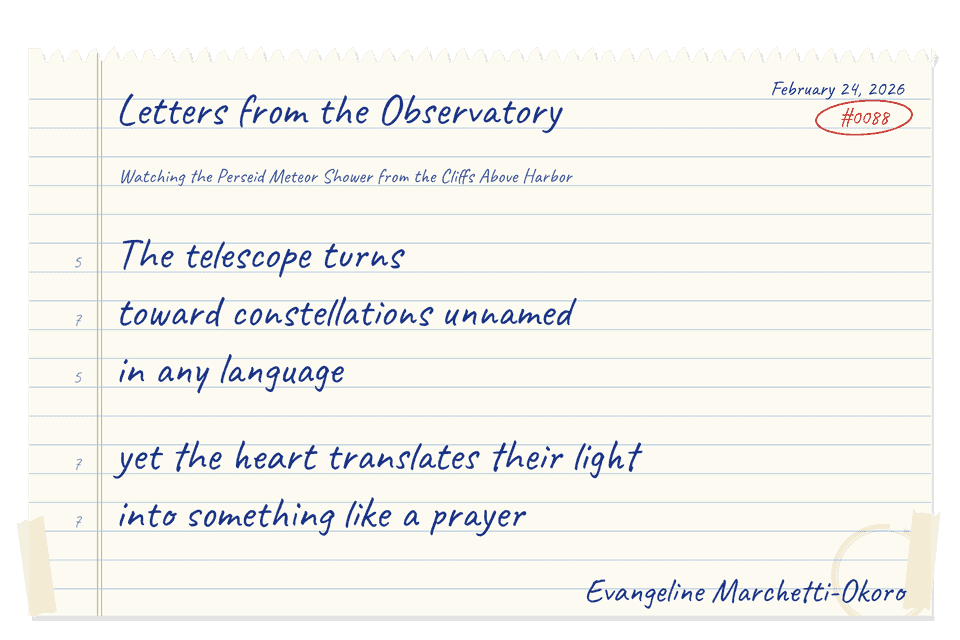
Notebook is a page torn out of a spiral notebook, written in ballpoint on the rules, with the shape of the form pencilled in the margin.
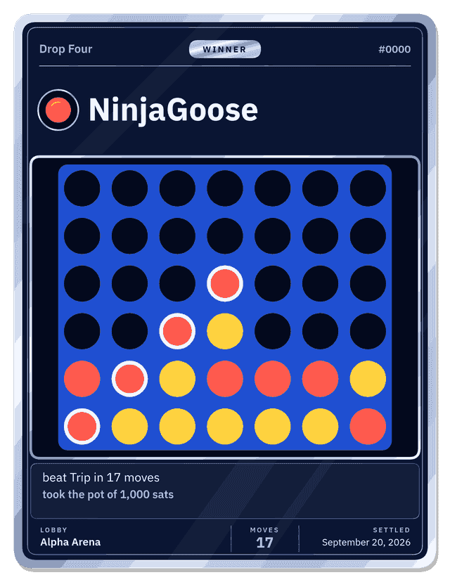
The game trophies are trading cards: a foil border, the winner as the title beside their mark, and the final board framed as the art.
Town Green is a ticket-only set: a bandstand on a New England town green at dusk, with the event name on the evening sky and the details on the grass. It draws tickets and nothing else, so it carries no page templates.
Techniques that worked
- Draw the words' worst case first. Decide where the longest title and the longest body go before you draw the ornament around them. Every published set was laid out that way.
- Let related lines move together. A title, subtitle and byline stacked as one group push each other down when a long title wraps, instead of printing over each other. The markers show how.
- A poem's lines are one size. When one line of a poem runs long, the whole poem steps down together rather than that one line shrinking or wrapping.
- Put effects on a group, not on the words. Glow, blur and outlines belong on a group around a text element. The words themselves are rebuilt when a piece renders, and anything on them that is not position, typeface, size, weight or colour is dropped.
Next
Drawing a Template is the workshop - the markers, the canvas rules, the traps, and a starter file you can change today.